Salesforce lightning experience is a contemporary user-interface that helps in building sales and simplifies the process of sales for business users. The software is meant for users who do not have any programming experience. Lightning incorporates the troupe of tools and technologies. Lightning is the one-stop solution for the non-coders to pro-coders. There are many affirmatives to the Lightning experience, but as an ultimate user and administrator, we have advocated few user experience issues while experiencing the tool.
The update of LEX with Winter 18 version brought the ability to perform text-wrapping on the fields like search results, list views, and related lists. It would be better if the columns were wrapped by default.
The Salesforce Classic is said to be productive because the related lists are allowed for text wrapping of fields. Field truncation in this version is quite trouble-free as it supports up to 10 fields per related list. Also, Salesforce Classic wraps the text based on the size of the browser window (screen size dependent) so that full text [name of field] is visible. This makes selecting a record very convenient and hassle-free.

Now, this is how LEX handles the same related list.

All the Salesforce administrators who use Salesforce Classic know that a configuration modification could be made spontaneous, and the modifications can be applied in real-time. But this does not happen in Salesforce Lightning. In LEX, we need to refresh a page several times to view the configured updates.
With Spring 17, modifications made to Lightning Record pages take several refreshes for the actual modifications to reflect upon the actual record. Following screenshot depicts how the Project related list looks like on hover.

The reports we generate are never saved! They were a one-time use for a specific purpose, but never be used again.

LEX does not let the users create these throwaway reports without saving them. So, as an admin or end user, you need to remember to go back and delete the report. Trashing is an unnecessary step!
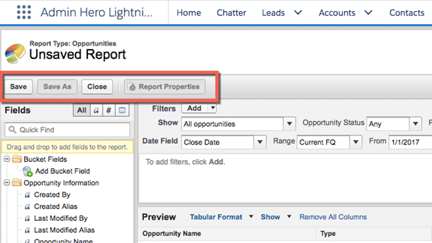
The Winter 18 release brought the new Report Builder feature in beta version, and it brings back the run report option so that you’re no longer need to save the report before running it. Amazing!
Salesforce Classic allows open links in a new tab, and whenever we navigate to that tab, the record page has already loaded. Splendid!
Although LEX is getting better, buy it do not allow records to open in the background quickly. Usually, it takes several seconds to load once. It is really a waste of time!
Setup menus are not at all updated to LEX. Assuming, In Salesforce Classic, if we navigate to profiles, and then we have to open each of the profile we want to modify in a new chrome tab. But, in LEX if we try the same, the tab opens but displays nothing!

It might not be noticeable immediately but, in LEX there can be found some strange reporting chart abnormalities. Once noticed, it would result in annoyance. Have a look at the screenshots below:-

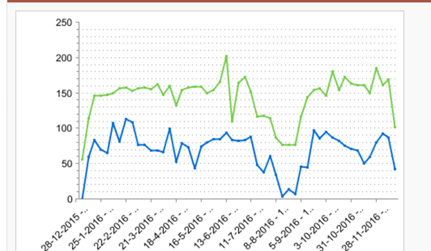
These charts ideally look identical. The first screenshot is taken from Salesforce Lightning Experience (LEX) and the second one from Salesforce Classic. It is noticeable how the axis is scaled differently in LEX? It is an impact on how the chart is anchorage.
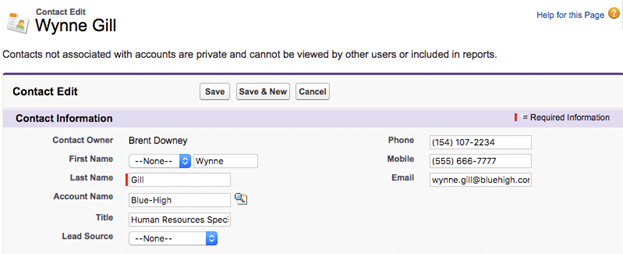
Below is the example of a contact record in Salesforce Classic.
Now, below is the same contact record in LEX.
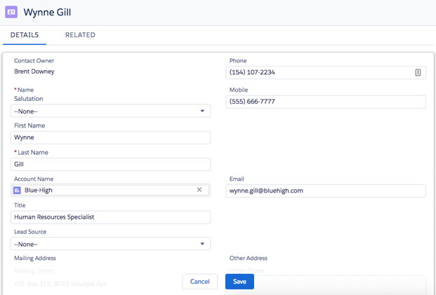
Notice the giant gaps before and after of mobile or email or any other field. This extra white space is actually useless. Although, as an end user or a normal user, most people love the white space design. But the above is too much!
LEX fixes this issue with the release of Winter 18. It introduced Display Density settings. It now looks similar to Gmail where you can choose a denser or less dense view of Salesforce. These settings are now can be controlled by the user. But the default density is determined by the admin for the overall organization as a beginning point.
How do you feel when your system repeatedly popups these messages? Salesforce wants to collect more accurate user feedback for the errors which create trouble for them. That is why this screen is important. But the error message displays multiple times on the screen even for a single error. It’s irritating!
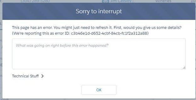
This issue is already fixed by Salesforce and is significantly reduced over the past few releases.
In Salesforce LEX, overall design and Look n feel is good; but there is not enough color contrast. The fields can be a bit more called out. And the contrast between field labels and field values can be better clarified.
Thankfully! In the last few updates, Salesforce has increased the color contrast. And with Spring 18 release, it has allowed for organization branding which further enhances the contrast of the page.
Let us assume if I’m working on a Salesforce record, and later I realize that I need or I want to switch back to the Salesforce Classic; the current page on the lightning should be the page that loads when navigating back to the Classic version. The fact that switching between Lighting and Classic requires retracing navigational steps to access the record is a productivity killer.
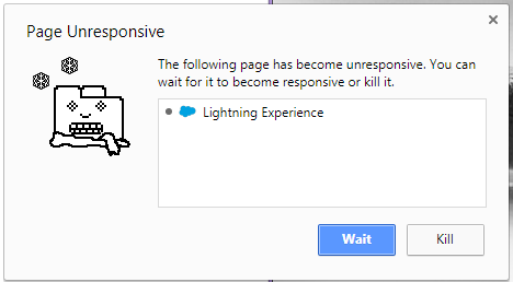
While performing development or working as a normal user, the Lightning experience keeps on freezing. It is both regular and random freezing. Either we have to refresh the LEX environment again and again or need to press F5 key.
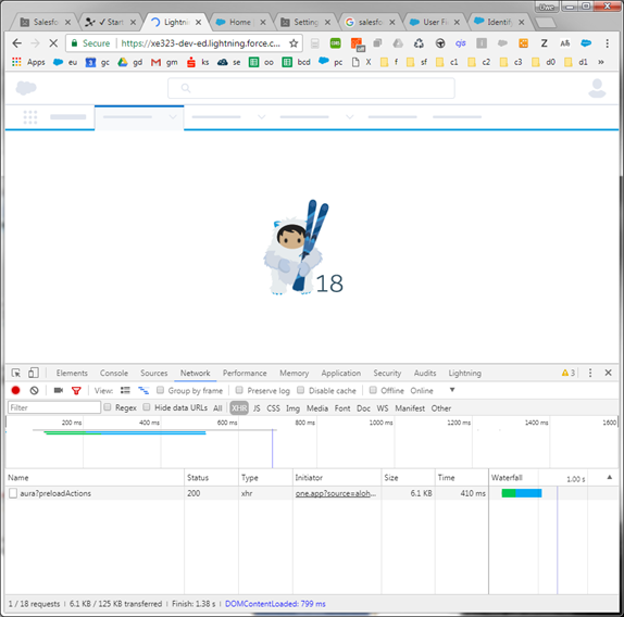
The page unresponsive popups really irritate us! Multiple trials of uninstalling all browser extensions, clearing browser cache, installing different versions of chrome; all these did not help at all! Hope this user experience crash will also fix soon!
In this post, we have tried to cover most of the user experience issues that were occurring in Salesforce Lightning Experience. If you find more, share by posting in the comments section below.
Stop, read and acquire deep insights into complex issues
© 2025 Copyright - JanBask.com | Designed by - JanBask Digital Design
Write a Comment